Computer Concepts in ActionUnit 7:
PresentationsCOMMUNICATION AND VISUAL DESIGN: AN INTERNET WEBQUESTIntroduction
The Task
Process
Guidance
Resources
Introduction - A movie director lights a scene to set a romantic mood;
- A video game designer chooses colors and shapes to help
gamers navigate;
- A graphic artist designs a book so that it is easy to follow;
- A car designer lays out a dashboard to convey information
quickly to the driver.
Good visual communication is easily understood, even if it is unconscious. Poor visual communication can be unclear, frustrating, and sometimes even dangerous. The schools in your area are coordinating an exhibition about visual communication. The organizers of the exhibition believe that many people are unaware of the basics of good visual communication. They have asked interested students to submit a PowerPoint presentation summarizing the basics of effective visual communication. Top The Task You will research visual communication, organize a presentation, and then create a PowerPoint presentation based on what you have learned. The topic of your presentation is up to you. You could:
- Show a portfolio of your work;
- Explain how and why you designed your Web home page;
- Explain visual elements for game design;
- Discuss how to write a resume;
- Or, you may want to demonstrate how art works are composed of
basic visual elements such as line and color.
Below is a brief description of each of your tasks for this
WebQuest: Task 1: Research the Visual
As a visual designer, your first
task is to gather information covering visual design basics from
different sources on the Web. You will decide on the topic of your
presentation and your audience.
Task 2: Organize your Ideas
Organize your research to prepare
for Task 3.
Task 3: Create a PowerPoint Outline
Use your organized
research to create a presentation outline in Word or PowerPoint.
Task 4: Creating the Visual Communication Presentation
Create a
PowerPoint presentation based on your outline, using the concepts of
visual communication in the design of your slides.
The Process section below
has a detailed description of each activity. The Guidance
section has helpful hints, and the Resource
section lists useful Web sites for you to use for your research.
Top Process Communication exists on many levels and messages are presented in many forms. We read facial expressions and body language along with listening to the words. People also communicate using messages in the form of pictures, color, and visual arrangements. Red and green lights, when used as traffic signals, are visual messages that tell a driver when to stop and go. Red and green signs in December let us know that it's time to do Christmas shopping. Messages can also be sent through texture, size, or spatial arrangements. Visual messages are common in our everyday lives. (Bernice Glenn & Don Busché, The Desktop Design Workbook, Regents/Prentice Hall, 1993.) Task 1: Research the Visual
A good visual designer begins the research using several different
sources. If you use only one source, the information you find may be
too limited or too slanted in one direction. You may use the URLs in
the Resource section below for your research or find ones of your
own. You will need to use several sites and review the information
from each site carefully. When you explore, think about the material
you are reading. Ask yourself what the information tells you.
If your teacher allows, print the page(s) for your research files. Otherwise, make notes and rough sketches on what you discover. Include the URL for each site you visited, the author, the date you visited the site, and any other information you may find useful. Recording your research notes on index cards is a useful technique for organizing your information. And remember—it is a form of plagiarism to copy any text directly, unless you say that it is a quote, and cite the source.
Visual awareness is a key element in communication. Visual
communication is created from very straightforward elements: lines,
shapes, textures, colors, dark and light qualities, scale, and actual
or implied space. How you use them is up to you and the messages you
wish to convey. Use the following tips to help guide your process. Design for Your Audience
The first thing to establish is the audience for the presentation.
A resume posted on a PowerPoint presentation has a different look and
purpose than a list of your favorite music sites for your friends.
You will need to create a plan your PowerPoint presentation along
with doing the research.
- What is your presentation for? What are its goals? Is it to
look for a job or to be a photo portfolio? Do you want to show how
to design a Web Home page or how to look at a work of art?
- Who is your audience? How will they benefit from this
presentation?
- What kind of material will your audience best respond to?
Charts and graphs? Cartoons?
- What is the tone of your presentation? Serious, silly,
scientific? Do you want to make a strong statement, or speak softly
to your audience?
Understand Visual Relationships
Visual relationships define the communication through similarities and differences. A difference in size lets the viewer know that the larger element is more important than the smaller one. When two elements look the same, we think that they are alike in meaning or importance. When your text says one thing i.e., “this is very important,” and the visual implies another i.e., it is smaller than the other text on the page, it is called a mixed message. Mixed messages are confusing and unclear to the viewer. The following table showing comparisons between conversational
speech and PowerPoint elements may help you to design your visual
communication elements.
Table 1: The elements of speech and giving a presentation are
related.
Elements of
Conversational Speech | Elements of a
PowerPoint Presentation | The conversation opener: Did you hear about …? | Title of your presentation | Announcements each topic and event. What is it about? What do
you think about it? | Main topic slides in a presentation
| Details of each topic and event. | Contents of presentation slides under a main topic | Louder speech to emphasize a point
| Subheadings used as visual punctuation; sound | Gestures | Graphics and other images | Silences | White space such as margins and paragraph spaces |
Use a Template
An easy way to provide a consistent design for each slide of a
presentation is through a template: - Choose a template that is suits your subject and audience.
- Templates can be modified to change type faces, colors, the
background, or other features.
- Designing your own template can take a great deal of time for
the inexperienced designer.
- Your template is the basis for consistent uniformity from one
slide to the next. If you change the style or placement of an
element haphazardly, your viewer may be confused and misunderstand
the information displayed by the change.
Understand Symmetry and Balance - Slide layouts can be symmetrical - or evenly balanced. This is a format used for wedding announcements and other formal occasions.
- Layouts that are asymmetrical - or unevenly balanced - are more dynamic and interesting. They also allow more ways to place graphics on a slide.
- Alignment is the way objects are lined up - on the left, right, or centered.
- White space (or empty space) is area that is left vacant.
Empty spaces relax the eye, and also guide the viewer to important
parts of your message. NOTE: If you have a slide that is full of
text and images, avoid the clutter by creating a 2nd slide for part
of the information.
Figure 1: Use a layout that matches the content. 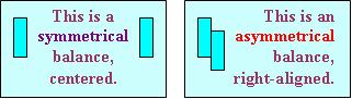 <a onClick="window.open('/olcweb/cgi/pluginpop.cgi?it=jpg::::/sites/dl/free/0078612357/271274/7_1_symmetry.JPG','popWin', 'width=NaN,height=NaN,resizable,scrollbars');" href="#"><img valign="absmiddle" height="16" width="16" border="0" src="/olcweb/styles/shared/linkicons/image.gif"> (9.0K)</a> <a onClick="window.open('/olcweb/cgi/pluginpop.cgi?it=jpg::::/sites/dl/free/0078612357/271274/7_1_symmetry.JPG','popWin', 'width=NaN,height=NaN,resizable,scrollbars');" href="#"><img valign="absmiddle" height="16" width="16" border="0" src="/olcweb/styles/shared/linkicons/image.gif"> (9.0K)</a>
What Colors Should I Use?
Color is often one of the first elements of design that we notice. Color can evoke emotion. (I feel blue; I'm so mad I saw red.) You can set a mood with color. Warm colors like red, orange, and yellow set a mood of excitement while cool colors like blue and green call up a peaceful scene.
Figure 2: Colors can set a mood. 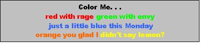 <a onClick="window.open('/olcweb/cgi/pluginpop.cgi?it=jpg::::/sites/dl/free/0078612357/271274/7_2_colorbox.jpg','popWin', 'width=NaN,height=NaN,resizable,scrollbars');" href="#"><img valign="absmiddle" height="16" width="16" border="0" src="/olcweb/styles/shared/linkicons/image.gif"> (8.0K)</a> <a onClick="window.open('/olcweb/cgi/pluginpop.cgi?it=jpg::::/sites/dl/free/0078612357/271274/7_2_colorbox.jpg','popWin', 'width=NaN,height=NaN,resizable,scrollbars');" href="#"><img valign="absmiddle" height="16" width="16" border="0" src="/olcweb/styles/shared/linkicons/image.gif"> (8.0K)</a>
Tips: Use high contrast colors for readability like yellow on dark
blue or dark blue on yellow. Figure 3: Use contrasting colors. 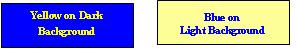 <a onClick="window.open('/olcweb/cgi/pluginpop.cgi?it=jpg::::/sites/dl/free/0078612357/271274/7_3_contrast.JPG','popWin', 'width=NaN,height=NaN,resizable,scrollbars');" href="#"><img valign="absmiddle" height="16" width="16" border="0" src="/olcweb/styles/shared/linkicons/image.gif"> (5.0K)</a> <a onClick="window.open('/olcweb/cgi/pluginpop.cgi?it=jpg::::/sites/dl/free/0078612357/271274/7_3_contrast.JPG','popWin', 'width=NaN,height=NaN,resizable,scrollbars');" href="#"><img valign="absmiddle" height="16" width="16" border="0" src="/olcweb/styles/shared/linkicons/image.gif"> (5.0K)</a>
Once you decide on the mood of your communication, select a
limited palette (group) of colors that work for the mood you want.
Use your colors all the way through the presentation. If you use
different colors on every slide your viewer is unconsciously confused
by an inconsistent or mixed message.
The background color sets the tone of your presentation. A muted
light color allows you to use strong dark text as contrast; a neutral
dark color allows you to use bright light colors for text.
9.5% of males are colorblind to reds or greens and see them as
shades of gray. If you use these colors, a high contrast makes them
legible to colorblind viewers. Pick the Right Fonts
Choose fonts that your audience can read - even from the back row. Sans serif fonts are more readable on a computer screen and projected on a screen. Sans serif fonts, like Arial and Verdana, do not have serifs, the little lines at the ends of the main strokes. Serif fonts like Times Roman and Palatino are easier to read on a printed page. Don't Put Too Much Content on a Slide
Limit each slide to 25 to 30 words. If you are reaching a limit, create a second slide. Be sure that the words you use are necessary. Short phrases along with bulleted lists work well. Figure 4: If you have too much text on one slide, create two. 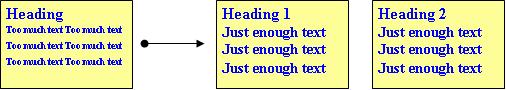 <a onClick="window.open('/olcweb/cgi/pluginpop.cgi?it=jpg::::/sites/dl/free/0078612357/271274/7_4_text.JPG','popWin', 'width=NaN,height=NaN,resizable,scrollbars');" href="#"><img valign="absmiddle" height="16" width="16" border="0" src="/olcweb/styles/shared/linkicons/image.gif"> (17.0K)</a> <a onClick="window.open('/olcweb/cgi/pluginpop.cgi?it=jpg::::/sites/dl/free/0078612357/271274/7_4_text.JPG','popWin', 'width=NaN,height=NaN,resizable,scrollbars');" href="#"><img valign="absmiddle" height="16" width="16" border="0" src="/olcweb/styles/shared/linkicons/image.gif"> (17.0K)</a>
Choose Images that Match the Content
Use images that make a difference. If your image doesn't communicate along with the content, look for another one that does. For tips on visual communication and extra help on how to take
good notes using index cards, go to the Guidance
section. Use links provided in the Resource
section to do your research. Task 2: Organizing Your Notes
You covered a huge amount
of ground in Step 1, getting all your research done. Now, you need to
organize notes in a logical sequence. You want the order of your
notes to reflect how you plan to design your PowerPoint presentation.
If you transferred your note topics to index cards, it will be easy
to shuffle them into an orderly arrangement for your outline.
Task 3: Creating Your PowerPoint Story Outline - Decide on what your content story will be.
- Describe your audience and the mood of your presentation.
- Define your color scheme
- Choose a template. Modify it if you wish to change the type
or some of the colors.
- Refer to Guidance
for examples of a story outline
As you work on your outline, think about how you would answer the
following questions: - What are the differences between communicating visually or
with the spoken word?
- Does visual communication have a language? What do you think
it is?
- Did learning about the rules and vocabulary for visual
communication help you understand more about good design? Did you
learn what you can do to make a presentation look personal,
corporate, vibrant, trendy, kid-friendly, or professional?
- Should everyone be able to communicate visually as well as
with the written word?
Task 4: Creating Your PowerPoint Story
Finally, it's time to get started on your presentation. Create at least 8 slides using what you have learned from your research: Your PowerPoint presentation should cite your sources of
information to prove to your school that you are an honest and
reliable visual designer. NOTE: Call your last slide Credits, and
cite all your sources. Also be sure to spell check and proofread your
presentation to show that you are accurate and professional.
Top Guidance This section provides helpful hints on how organize your
presentation. Structure and Organization
“There has always been a difference between presentation and organization, though in my experience, this is a difficult distinction for many people. ….The design of the presentation is a separate act that cannot be done well until the organization (or, structure) is first completed. Presentation can take many forms and there are definitely serious decisions to make.” Design Matters STC Information Design Group, 04/01, Nathan Shedroff, Author, Experience Design San Francisco, CA:
Organizing Your Notes
Put your notes on index cards. Use a different index card for each
item. That way, when you start your outline, you can shuffle the
cards to organize them into a logical arrangement.
Figure 5: Organize your research on index cards. 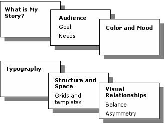 <a onClick="window.open('/olcweb/cgi/pluginpop.cgi?it=jpg::::/sites/dl/free/0078612357/271274/7_5_Index_cards.JPG','popWin', 'width=NaN,height=NaN,resizable,scrollbars');" href="#"><img valign="absmiddle" height="16" width="16" border="0" src="/olcweb/styles/shared/linkicons/image.gif"> (15.0K)</a> <a onClick="window.open('/olcweb/cgi/pluginpop.cgi?it=jpg::::/sites/dl/free/0078612357/271274/7_5_Index_cards.JPG','popWin', 'width=NaN,height=NaN,resizable,scrollbars');" href="#"><img valign="absmiddle" height="16" width="16" border="0" src="/olcweb/styles/shared/linkicons/image.gif"> (15.0K)</a>
Read your notes, and shuffle them into a logical first draft
outline.
Creating an Outline
You can create your outline in either Microsoft Word or
PowerPoint. If you use Word, it is easy to make edits and corrections
in PowerPoint. If you use the Word outline function, style slide
titles as Heading 1 and first-level bulleted text as Heading 2. If
you choose to write your outline in Word as simple text, you can
apply the outline levels in PowerPoint.
To import your outline from Word to PowerPoint, follow these
steps: In the menu bar, select File then Open. In the Files of type drop-down list select All
Outlines. Locate your outline file and double-click it.
If you create your outline in PowerPoint, you can see all titles
and main text on the screen as you work by selecting the Outline tab
in the view pane. Sample PowerPoint Outline
This sample outline is a description of a game design, built on
the elements of visual communication. Your presentation should
include visual examples wherever possible. This is an example only.
Do not use!
Slide 1: Title Slide 2: Audience Slide 3: Mood and Color Slide 3: Typography Choose type that is easy to read.
For directions, use a clean sans serif type like Verdana.
(illustrate) For titles, use type that is larger and sets a mood but is
still easy to read. Comic Sans is one choice. (illustrate) Don't clutter instructions or directions with too many words. Use bullets to keep it short. (illustrate)
Slide 4: Structure and Space Be consistent in where you place your objects. Be consistent in how you use your colors. Example: Place objects like doors and secret passages in the
same places in your visual plan, no matter where the action goes.
Slide 5: Structure and Space 2 Slide 6: Visual Relationships Visual relationships are the way your player understands the rules of the game. It's something players understand without words. What things or more important. Show importance by size and
color. Less importance using size and color (illustrate) Show how objects can mean the same thing (illustrate) It's something players understand without words
Slide 7: Visual Relationships 2 Examples of visual relationships: Scale: Bigger is more important (illustrate) Color: Brighter is more important (illustrate) Contrast: Weak contrast is less important (illustrate)
Slide 8: Visual Relationships 3 Slide 9: Visual Relationships 4 Slide 10: Conclusion and Summary
Slide 11: Credits Working with Structure and Space - The Grid
Give
your presentation an orderly feel by creating a layout for visual
organization. Graphic designers call this type of layout a grid. The
grid provides a consistent arrangement of elements for each slide of
your presentation.
After you create your template, add a grid so as to maintain
orderly and spacing on all your slides. To set up a grid in
PowerPoint 2002 and 2003, do the following: In the Drawing toolbar, select Draw then Grid and
Guides.
In the Grid and Guides dialog box under Grid Settings, check
Display grid on screen. You can also set the grid spacing.
Click OK to close the dialog box.
Top Resources To search for more information on the Web go to
Google
or another search site. Try the keywords “visual language” to search for sources.
Visual Communication Resources ArtsConnectedEd: Art
Collections and activities from the Minneapolis Institute of Art
and the Walker Art Center
http://www.artsconnected.org/toolkit/index.html
This page
at the Walker Art Center explores the elements and principles that
artists use to build works of art: line, color, balance. While these
tools are oriented to fine art, the information works for any type of
visual communication. The Online Visual Literacy
Project
Verbal or written literacy exists with parts of speech, grammar, and
rules for common meaning. In the same way, visual literacy contains
basic elements as the source for all kinds of visual materials,
messages, objects and experiences. These basic elements are defined
and displayed as animations. PowerPoint Resources Basic Rules for Presentations PowerPoint Design Tips
These PowerPoint slide shows offer basic rules for a PowerPoint
presentation. Color Resources Effective Color Contrast
The Lighthouse, a facility for the visually handicapped, offers
appropriate color combinations. Web Color Theory
This online tool allows you to try out color combinations on a
dummy page. Drag
Exploration Resources Cyberteens
Share your creativity on this site. Go
here
to submit your own work http://redstudio.moma.org/
The Red Studio Web site, developed by MoMA (Museum of Modern Art), explores issues and questions raised by teens about modern art and today's working artists. Clip Art Northumberland NGfl Clip Art
This clip art
is freely available for use in education but must not be used for
commercial purposes or distributed on other clip art sites. The clip
art is copyright Northumberland LEA and GridRef2000. The Free Graphics Store
An excellent collection of small clip art suitable for
PowerPoint.
Collection Finder: American
Memory from the Library of Congress
The Library of Congress Collection Finder page list links that
retrieves a list of American Memory online collections. From that
list, you will be able to jump to an individual collection or search
for items in those collections.
Caution! | Some sites require that you be over 18, or that you have
written parental permission to register or
obtain a credit card. Do not
go to any site that has on over-18 requirement! Some sites require
that
you provide an email address in order to get information. While these
sites may be completely
legitimate, do not provide your email address
or any other personal information without checking
with your parents first.
|
Conclusion Congratulations on learning so much about visual communication and
the language of the eye. The coordinators of the exhibition have
accepted your presentation. They believe it will be an excellent
introduction to the basics of visual communication for all ages.  |